styled()
用于创建样式化组件的实用工具。
简介
所有 Material UI 组件都使用 styled() 实用工具进行样式化。此实用工具构建于 @mui/styled-engine 的 styled() 模块之上,并提供额外的功能。
导入路径
您可以使用来自 @mui/system 包的实用工具,或者如果您正在使用 @mui/material,您可以从 @mui/material/styles 导入它。区别在于使用的默认 theme(如果在 React 上下文中没有可用的主题)。
import { styled } from '@mui/system';
// If you are using @mui/material
import { styled } from '@mui/material/styles';
它解决了什么问题?
该实用工具可以用作 emotion 或 styled-components 的 styled() 实用工具的替代品。它的目标是解决相同的问题,但也提供以下好处
- 如果 React 上下文中没有可用的主题,它会使用默认的
theme。 - 它支持主题的
styleOverrides和variants,以便根据选项中应用的name应用(可以跳过)。 - 它增加了对
sx属性 的支持(可以跳过)。 - 默认情况下,它添加了
shouldForwardProp选项(可以被覆盖),考虑了:ownerState、theme、sx和as。
API
styled(Component, [options])(styles) => Component
参数
Component:将被包裹的组件。options(对象 [可选])options.shouldForwardProp((prop: string) => bool[可选]):指示是否应将prop转发到Component。options.label(字符串 [可选]):样式表的后缀。用于调试很有用。options.name(字符串 [可选]):在theme.components下用于指定styleOverrides和variants的键。也用于生成label。options.slot(字符串 [可选]):如果为Root,它会自动应用主题的variants。options.overridesResolver((props: object, styles: Record<string, styles>) => styles [可选]):根据 props 和theme.components[name].styleOverrides对象返回样式的函数。options.skipVariantsResolver(bool):禁用theme.components[name].variants的自动解析器。options.skipSx(bool [可选]):禁用组件上的sx属性。- 其他键被转发到 emotion 的
styled([Component], [options])的options参数。
styles(对象 |({ ...props, theme }) => object[可选]):样式对象或返回样式对象的函数。该函数接收主题和组件的 props,这些 props 位于作为其单个参数的对象中。
返回值
Component:创建的新组件。
基本用法
自定义组件
此示例演示了如何使用 styled API 创建自定义组件,其功能与核心组件相同
如果您在开发模式下使用浏览器 DevTools 检查此元素,您会注意到组件的类现在以 MyThemeComponent-root 结尾,这来自提供的 name 和 slot 选项。
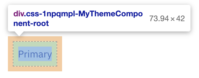
除此之外,color、sx 和 variant 属性不会传播到生成的 div 元素。
移除功能
如果您想删除一些 MUI System 特有的功能,您可以这样做
 const StyledComponent = styled('div', {}, {
   name: 'MuiStyled',
   slot: 'Root',
-  overridesResolver: (props, styles) => styles.root, // disables theme.components[name].styleOverrides
+  skipVariantsResolver: true, // disables theme.components[name].variants
+  skipSx: true, // disables the sx prop
 });
创建自定义 styled() 实用工具
如果您想为 styled() 实用工具设置不同的默认主题,您可以使用 createStyled() 实用工具创建自己的版本。
import { createStyled, createTheme } from '@mui/system';

const defaultTheme = createTheme({
  // your custom theme values
});

const styled = createStyled({ defaultTheme });

export default styled;
与 sx 属性的区别
styled 函数是底层样式库(Emotion 或 styled-components)提供的 styled 实用工具的扩展。可以保证,对于相同的输入,它将产生与样式库中的 styled 函数相同的输出。
sx 属性是样式化组件的新方法,专注于快速自定义。styled 是一个函数,而 sx 是使用 styled 创建的组件上可用的属性。
因此,您会注意到以下区别
sx 比 styled 提供更多快捷方式
使用 styled
const MyStyledButton = styled('button')({
  mx: 1, // ❌ don't use this! This shortcut is only provided by the `sx` prop
});
使用 sx
import Button from '@mui/material/Button';

const MyStyledButton = (props) => (
  <Button
    sx={{
      mx: 1, // ✔️ this shortcut is specific to the `sx` prop,
    }}
  >
    {props.children}
  </Button>
);
样式定义略有不同
使用 styled
const MyStyledButton = styled('button')({
  padding: 1, // means "1px", NOT "theme.spacing(1)"
});
使用 sx
import Button from '@mui/material/Button';

const MyStyledButton = (props) => (
  <Button
    sx={{
      padding: 1, // means "theme.spacing(1)", NOT "1px"
    }}
  >
    {props.children}
  </Button>
);
如何使用 props 的模式不同
使用 styled
const MyStyledButton = styled('button')((props) => ({
  backgroundColor: props.myBackgroundColor,
}));
使用 sx
import Button from '@mui/material/Button';

const MyStyledButton = (props) => (
  <Button sx={{ backgroundColor: props.myCustomColor }}>{props.children}</Button>
);
当使用函数时,每个字段的参数都不同
使用 styled(不推荐)
// You may find this syntax in the wild, but for code readability
// we recommend using only one top-level function
const MyStyledButtonPropsPerField = styled('button')({
  backgroundColor: (props) => props.myBackgroundColor,
});
使用 sx
import Button from '@mui/material/Button';
import { lighten } from 'polished';

const MyStyledButton = (props) => (
  <Button
    sx={{ backgroundColor: (theme) => lighten(0.2, theme.palette.primary.main) }}
  >
    {props.children}
  </Button>
);
// Note: for direct theme access without modification, you can also use a shortcut by providing the key as a string
const MyStyledButton = (props) => (
  <Button sx={{ backgroundColor: 'primary.main' }}>{props.children}</Button>
);
如何将 sx 语法与 styled() 实用工具一起使用?
如果您更喜欢 sx 语法,并想在 sx 属性和 styled() 实用工具中都使用它,您可以使用来自 theme 的 unstable_sx 实用工具
使用 unstable_sx 实用工具增加的开销与在组件上使用 sx 属性的开销相同。
如何使用组件选择器 API
如果您曾经使用过 emotion 或 styled-components 的 styled() API,您应该已经能够使用组件作为选择器。
import styled from '@emotion/styled';

const Child = styled.div`
  color: red;
`;

const Parent = styled.div`
  ${Child} {
    color: green;
  }
`;

render(
  <div>
    <Parent>
      <Child>Green because I am inside a Parent</Child>
    </Parent>
    <Child>Red because I am not inside a Parent</Child>
  </div>,
);
使用 MUI System 的 styled() 实用工具,您也可以使用组件作为选择器。当使用 @mui/styled-engine-sc (styled-components) 时,无需执行任何操作。当使用 @mui/styled-engine (emotion),默认引擎时,您应该执行几个步骤
首先,您应该安装 @emotion/babel-plugin。
npm install @emotion/babel-plugin
然后,配置插件以了解 Material UI 版本的 styled() 实用工具
babel.config.js
module.exports = {
  ...
  plugins: [
    [
      "@emotion",
      {
        importMap: {
          "@mui/system": {
            styled: {
              canonicalImport: ["@emotion/styled", "default"],
              styledBaseImport: ["@mui/system", "styled"]
            }
          },
          "@mui/material": {
            styled: {
              canonicalImport: ["@emotion/styled", "default"],
              styledBaseImport: ["@mui/material", "styled"]
            }
          },
          "@mui/material/styles": {
            styled: {
              canonicalImport: ["@emotion/styled", "default"],
              styledBaseImport: ["@mui/material/styles", "styled"]
            }
          }
        }
      }
    ]
  ]
};
现在您应该能够使用组件作为您的选择器了!