从 v3 迁移到 v4
是的,v4 已发布!
正在寻找 v3 文档?您可以在此处找到最新版本。
简介
这是将您的网站从 Material UI v3 升级到 v4 的参考指南。虽然此处涵盖了很多内容,但您的网站可能不需要执行所有操作。我们将尽力使内容易于理解,并尽可能按顺序排列,以便您可以快速开始使用 v4!
您应该迁移的原因
此文档页面涵盖了从 v3 迁移到 v4 的方法。原因在 Medium 上的发布博文中 有介绍。
更新您的依赖项
您需要做的第一件事是更新您的依赖项。
更新 Material UI 版本
您需要更新您的 package.json 以使用最新版本的 Material UI。
"dependencies": {
  "@material-ui/core": "^4.0.0"
}
或运行
npm install @material-ui/core

or

yarn add @material-ui/core
更新 React 版本
React 的最低必需版本已从 react@^16.3.0 增加到 react@^16.8.0。这使我们能够依赖 Hooks(我们不再使用 class API)。
更新 Material UI Styles 版本
如果您之前在 v3 中使用 @material-ui/styles,则需要更新您的 package.json 以使用最新版本的 Material UI Styles。
"dependencies": {
  "@material-ui/styles": "^4.0.0"
}
或运行
npm install @material-ui/styles

or

yarn add @material-ui/styles
处理重大变更
核心
- 每个组件都转发其 ref。这是通过使用
React.forwardRef()实现的。这会影响内部组件树和显示名称,因此可能会破坏浅层或快照测试。innerRef将不再返回对实例的 ref(如果内部组件是函数组件,则不返回任何内容),而是返回对其根组件的 ref。相应的 API 文档列出了根组件。
样式
⚠️ Material UI 依赖于 JSS v10。JSS v10 与 v9 不向后兼容。确保您的环境中未安装 JSS v9。(从您的
package.json中删除react-jss可以有所帮助)。StylesProvider 组件取代了 JssProvider 组件。删除
withTheme()的第一个选项参数。(第一个参数是未来可能出现的选项的占位符,但从未出现。)它与 emotion API 和 styled-components API 相匹配。
-const DeepChild = withTheme()(DeepChildRaw); +const DeepChild = withTheme(DeepChildRaw);将
convertHexToRGB重命名为hexToRgb。-import { convertHexToRgb } from '@material-ui/core/styles/colorManipulator'; +import { hexToRgb } from '@material-ui/core/styles';作用域 keyframes API。您应该在代码库中应用以下更改。它有助于隔离动画逻辑
  rippleVisible: {
    opacity: 0.3,
-   animation: 'mui-ripple-enter 100ms cubic-bezier(0.4, 0, 0.2, 1)',
+   animation: '$mui-ripple-enter 100ms cubic-bezier(0.4, 0, 0.2, 1)',
  },
  '@keyframes mui-ripple-enter': {
    '0%': {
      opacity: 0.1,
    },
    '100%': {
      opacity: 0.3,
    },
  },
主题
theme.palette.augmentColor()方法不再对其输入颜色执行副作用。要正确使用它,您必须使用返回的值。-const background = { main: color }; -theme.palette.augmentColor(background); +const background = theme.palette.augmentColor({ main: color }); console.log({ background });您可以安全地从主题创建中删除下一个变体
typography: { - useNextVariants: true, },theme.spacing.unit用法已弃用,您可以使用新的 APIlabel: { [theme.breakpoints.up('sm')]: { - paddingTop: theme.spacing.unit * 12, + paddingTop: theme.spacing(12), }, }提示:您可以提供多个参数:
theme.spacing(1, 2) // = '8px 16px'.您可以使用 迁移助手 在您的项目上使此过程更顺畅。
布局
[Grid] 为了支持任意间距值并消除按 8 mentally count 的需要,我们正在更改间距 API
/** * Defines the space between the type `item` component. * It can only be used on a type `container` component. */ - spacing: PropTypes.oneOf([0, 8, 16, 24, 32, 40]), + spacing: PropTypes.oneOf([0, 1, 2, 3, 4, 5, 6, 7, 8, 9, 10]),展望未来,您可以使用主题来实现 自定义 Grid 间距转换函数。
[Container] 从
@material-ui/lab移动到@material-ui/core。-import Container from '@material-ui/lab/Container'; +import Container from '@material-ui/core/Container';
TypeScript
value 类型
规范化输入组件的 value prop 类型以使用 unknown。这会影响 InputBase、NativeSelect、OutlinedInput、Radio、RadioGroup、Select、SelectInput、Switch、TextArea 和 TextField。
 function MySelect({ children }) {
-  const handleChange = (event: any, value: string) => {
+  const handleChange = (event: any, value: unknown) => {
     // handle value
   };

   return <Select onChange={handleChange}>{children}</Select>
 }
此更改在 TypeScript 指南 中有更详细的说明
按钮
[Button] 删除已弃用的按钮变体(flat、raised 和 fab)
-<Button variant="raised" /> +<Button variant="contained" />-<Button variant="flat" /> +<Button variant="text" />-import Button from '@material-ui/core/Button'; -<Button variant="fab" /> +import Fab from '@material-ui/core/Fab'; +<Fab />-import Button from '@material-ui/core/Button'; -<Button variant="extendedFab" /> +import Fab from '@material-ui/core/Fab'; +<Fab variant="extended" />[ButtonBase] 传递给
componentprop 的组件需要能够容纳 ref。组合指南 解释了迁移策略。这也适用于
BottomNavigationAction、Button、CardActionArea、Checkbox、ExpansionPanelSummary、Fab、IconButton、MenuItem、Radio、StepButton、Tab、TableSortLabel以及ListItem(如果buttonprop 为 true)。
卡片
- [CardActions] 将
disableActionSpacingprop 重命名为disableSpacing。 - [CardActions] 删除
disableActionSpacingCSS 类。 - [CardActions] 将
actionCSS 类重命名为spacing。
ClickAwayListener
- [ClickAwayListener] 隐藏 react-event-listener props。
对话框
- [DialogActions] 将
disableActionSpacingprop 重命名为disableSpacing。 - [DialogActions] 将
actionCSS 类重命名为spacing。 - [DialogContentText] 使用排版变体
body1而不是subtitle1。 - [Dialog] 子项需要能够容纳 ref。组合指南 解释了迁移策略。
分隔线
[Divider] 删除已弃用的
insetprop。-<Divider inset /> +<Divider variant="inset" />
ExpansionPanel
- [ExpansionPanelActions] 将
actionCSS 类重命名为spacing。 - [ExpansionPanel] 增加
disabled和expanded样式规则的 CSS 特异性。 - [ExpansionPanel] 将
CollapsePropsprop 重命名为TransitionProps。
列表
[List] 重新设计列表组件以匹配规范
- 使用头像时,需要
ListItemAvatar组件。 - 使用左侧复选框时,需要
ListItemIcon组件。 edge属性应在图标按钮上设置。
- 使用头像时,需要
[List]
dense不再减少List元素的顶部和底部内边距。[ListItem] 增加
disabled和focusVisible样式规则的 CSS 特异性。
菜单
- [MenuItem] 删除 MenuItem 的固定高度。浏览器使用内边距和行高来计算高度。
模态框
[Modal] 子项需要能够容纳 ref。组合指南 解释了迁移策略。
这也适用于
Dialog和Popover。[Modal] 删除 Modal 组件的类自定义 API(独立使用时,捆绑包大小减少 -74%)。
[Modal] event.defaultPrevented 现在被忽略。即使在按下 escape 键事件时调用
event.preventDefault(),新逻辑也会关闭 Modal。event.preventDefault()旨在阻止默认行为,例如单击复选框以选中它、点击按钮以提交表单以及点击向左箭头以在文本输入等中移动光标。只有特殊的 HTML 元素才具有这些默认行为。如果您不希望在模态框上触发onClose事件,则应使用event.stopPropagation()。
纸张
[Paper] 降低默认海拔高度。更改默认 Paper 海拔高度以匹配 Card 和 Expansion Panel
-<Paper /> +<Paper elevation={2} />这也影响
ExpansionPanel。
Portal
- [Portal] 当使用
disablePortal时,子项需要能够容纳 ref。组合指南 解释了迁移策略。
Slide
- [Slide] 子项需要能够容纳 ref。组合指南 解释了迁移策略。
滑块
[Slider] 从
@material-ui/lab移动到@material-ui/core。-import Slider from '@material-ui/lab/Slider' +import Slider from '@material-ui/core/Slider'
开关
[Switch] 重构实现以使其更容易覆盖样式。重命名类名以匹配规范措辞
-icon
-bar
+thumb
+track
Snackbar
[Snackbar] 匹配新规范。
- 更改尺寸
- 将默认过渡从
Slide更改为Grow。
SvgIcon
[SvgIcon] 重命名 nativeColor -> htmlColor。React 使用
forHTML 属性解决了相同的问题,他们决定将 prop 称为htmlFor。此更改遵循相同的推理。-<AddIcon nativeColor="#fff" /> +<AddIcon htmlColor="#fff" />
选项卡
[Tab] 为了简单起见,删除
labelContainer、label和labelWrapped类键。这使我们能够删除 2 个中间 DOM 元素。您应该能够将自定义样式移动到root类键。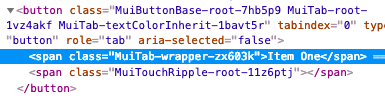
[Tabs] 删除已弃用的 fullWidth 和 scrollable props
-<Tabs fullWidth scrollable />
+<Tabs variant="scrollable" />
表格
[TableCell] 删除已弃用的
numeric属性-<TableCell numeric>{row.calories}</TableCell> +<TableCell align="right">{row.calories}</TableCell>[TableRow] 删除固定的高度 CSS 属性。浏览器使用内边距和行高来计算单元格高度。
[TableCell] 将
dense模式移动到不同的属性-<TableCell padding="dense" /> +<TableCell size="small" />[TablePagination] 该组件不再尝试修复无效的(
page、count、rowsPerPage)属性组合。而是发出警告。
TextField
[InputLabel] 您应该能够使用 InputLabel 组件的 CSS API 覆盖 FormLabel 组件的所有样式。
FormLabelClasses属性已被删除。<InputLabel - FormLabelClasses={{ asterisk: 'bar' }} + classes={{ asterisk: 'bar' }} > Foo </InputLabel>[InputBase] 更改默认的盒模型尺寸。它现在使用以下 CSS
box-sizing: border-box;这解决了
fullWidthprop 的问题。[InputBase] 从
InputBase中删除inputType类。
Tooltip
- [Tooltip] 子项需要能够容纳 ref。组合指南 解释了迁移策略。
- [Tooltip] 仅在 focus-visible 焦点之后出现,而不是任何焦点。
排版
[Typography] 删除已弃用的排版变体。您可以通过执行以下替换进行升级
- display4 => h1
- display3 => h2
- display2 => h3
- display1 => h4
- headline => h5
- title => h6
- subheading => subtitle1
- body2 => body1
- body1(默认)=> body2(默认)
[Typography] 删除固执己见的
display: block默认排版样式。您可以使用新的display?: 'initial' | 'inline' | 'block';属性。[Typography] 将
headlineMapping属性重命名为variantMapping,以更好地与其用途保持一致。-<Typography headlineMapping={headlineMapping}> +<Typography variantMapping={variantMapping}>[Typography] 将默认变体从
body2更改为body1。16px 的字体大小比 14px 更好。Bootstrap、material.io 甚至文档都使用 16px 作为默认字体大小。像 Ant Design 使用的 14px 是可以理解的,因为中国用户的字母表不同。建议将 12px 作为日语的默认字体大小。[Typography] 从排版变体中删除默认颜色。颜色在大多数情况下应该继承。这是 Web 的默认行为。
[Typography] 按照 此线程 的逻辑,将
color="default"重命名为color="initial"。应避免使用default,它缺乏语义。
Node
- 放弃 node 6 支持,您应该升级到 node 8。
UMD
此更改简化了 Material UI 与 CDN 的使用
const { Button, TextField, -} = window['material-ui']; +} = MaterialUI;它与其他 React 项目一致
- material-ui => MaterialUI
- react-dom => ReactDOM
- prop-types => PropTypes