Material UI Sync 插件 🧪
Sync 是一款 Figma 插件,可直接从设计稿生成 Material UI 主题代码。
简介
Material UI Sync 是一款 Figma 插件,可让您从 Material UI for Figma Design Kit 生成主题。
Sync 与 Material UI for Figma Design Kit v5.16.0 及更高版本的设计套件结合使用。
运行插件
如果您没有安装 完整和最新版本 的 Material UI for Figma Design Kit,您可以使用 社区版本 来测试此插件。
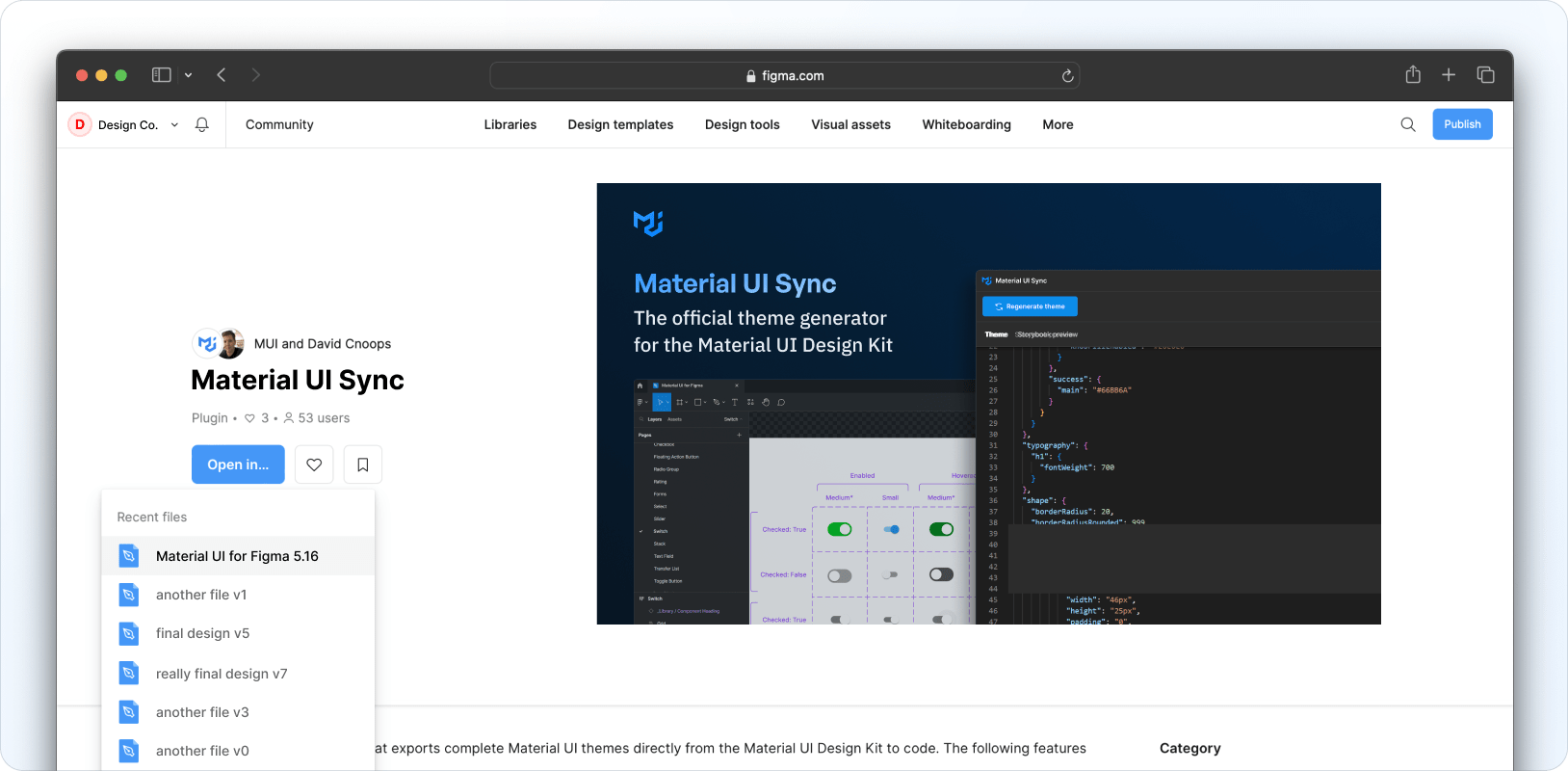
在 Figma 中安装并打开后,前往 Community 选项卡上的 Material UI Sync 插件页面,然后点击 Open in… 并选择 Material UI for Figma Design Kit。
自定义设计令牌
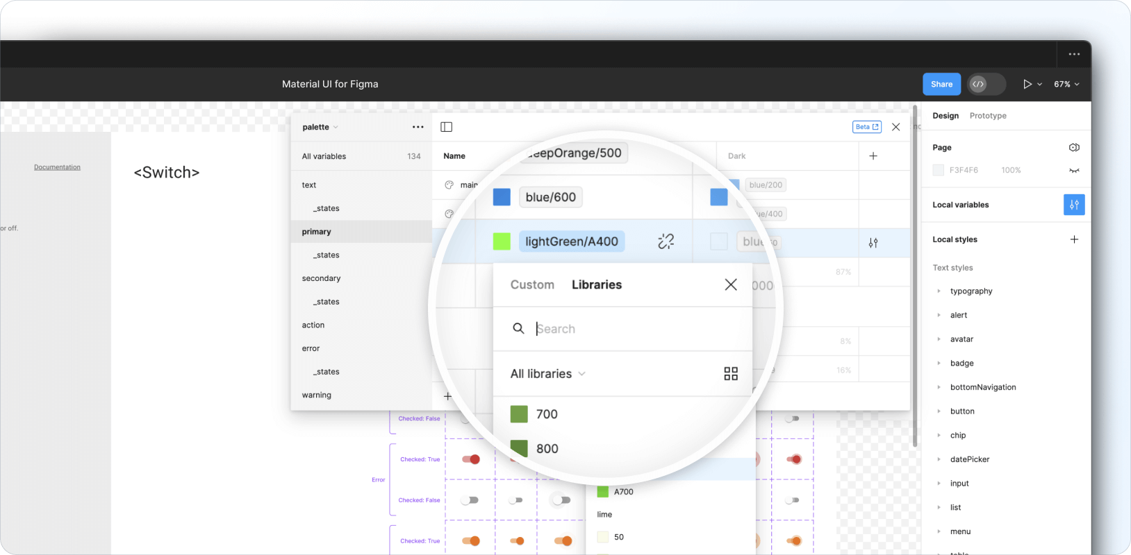
设计令牌在 Design Kit 的 本地变量集合 中定义,包括调色板、断点、形状和间距令牌。排版和阴影相关的令牌可以在 本地样式集合 中找到。
修改现有令牌
Design Kit 完全加载了设计令牌,这些令牌映射到 Material UI React 库的默认主题。
要自定义现有令牌,请点击如下所示的过滤器图标,打开本地变量模态框。根据需要调整集合中可用的任何变量(例如调色板、断点、形状和间距)。
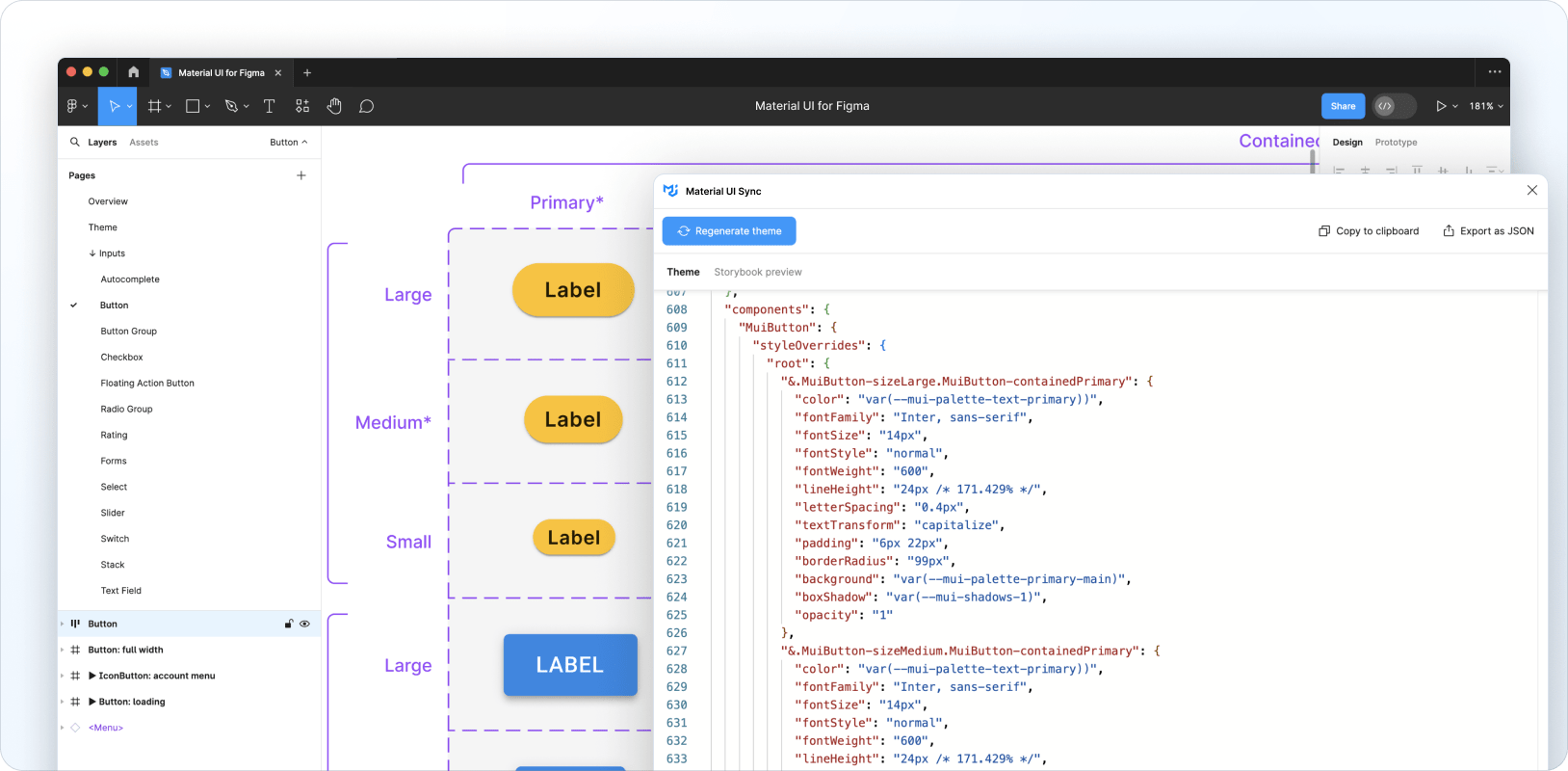
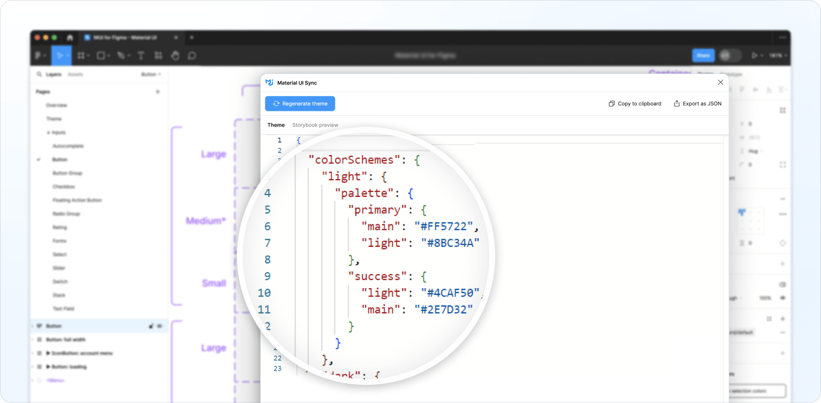
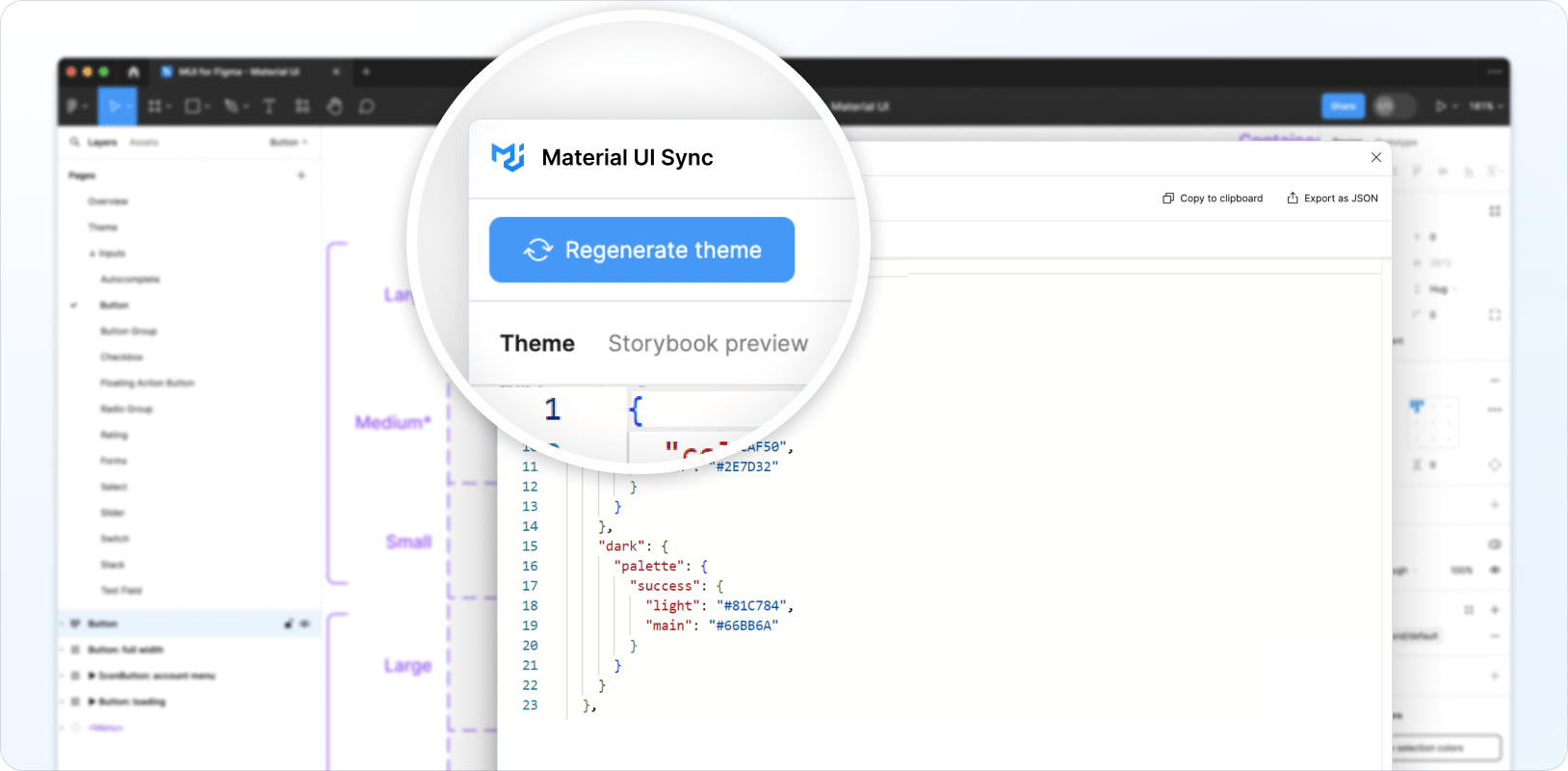
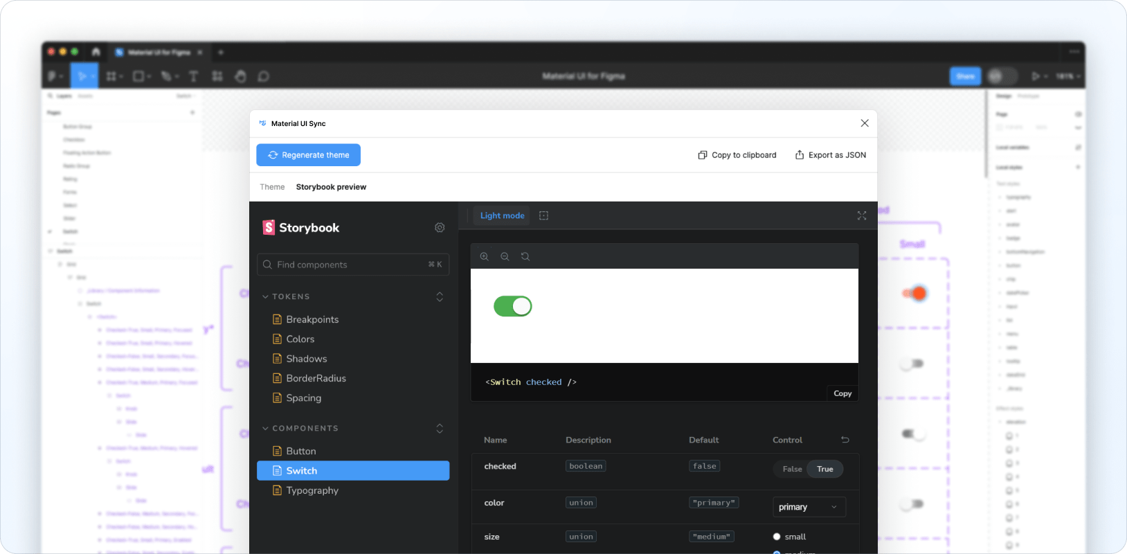
然后打开 Material UI Sync 插件并点击 Generate theme(生成主题)。
包含修改后令牌的主题将被生成并显示在插件的 Theme(主题)选项卡中。
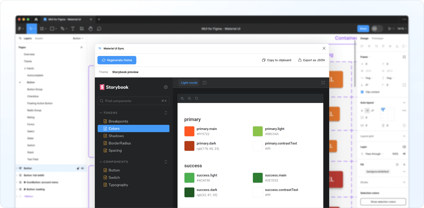
您还可以通过导航到 Storybook 预览选项卡来预览生成的主题和自定义的令牌。
添加新令牌
您可以通过以下方式使用自己的令牌扩展现有令牌集:将新变量添加到现有的本地变量集合,或者将新的 elevation 和 typography 样式添加到本地样式集合。添加自定义令牌后,点击 Regenerate theme(重新生成主题)以将这些令牌包含在您的主题中。
自定义组件
Sync 插件还可以为自定义组件生成主题样式,使您能够完全更改其外观和风格,并从 Figma 中创建自定义设计系统。
例如,以下是如何自定义 Switch 组件的选中状态、中等尺寸和原色,以复制 iOS 的外观和风格
Sync 插件为自定义的 Switch 生成以下主题代码
{
  components: {
    MuiSwitch: {
      styleOverrides: {
        root: {
          '&.MuiSwitch-sizeMedium:has(.MuiSwitch-colorPrimary)': {
            '&:has(.Mui-checked):not(:has(.Mui-disabled)):not(:has(.Mui-focusVisible))':
              {
                width: '40px',
                height: '21px',
                padding: '0',
                '& .MuiSwitch-switchBase': {
                  transform: 'translateX(19px) translateY(2px)',
                  padding: '0',
                  '& .MuiSwitch-thumb': {
                    width: '17px',
                    height: '17px',
                    background: '#FAFAFA',
                  },
                  '& + .MuiSwitch-track': {
                    width: '38px',
                    height: '21px',
                    background: 'var(--mui-palette-success-light)',
                    opacity: '1',
                  },
                },
              },
          },
        },
      },
    },
  },
}
生成的主题针对与上述特定 Switch 配置相对应的类,因此仅当 Material UI 组件的 props 和状态与自定义 Figma 组件的 props 和状态匹配时,才会应用样式。
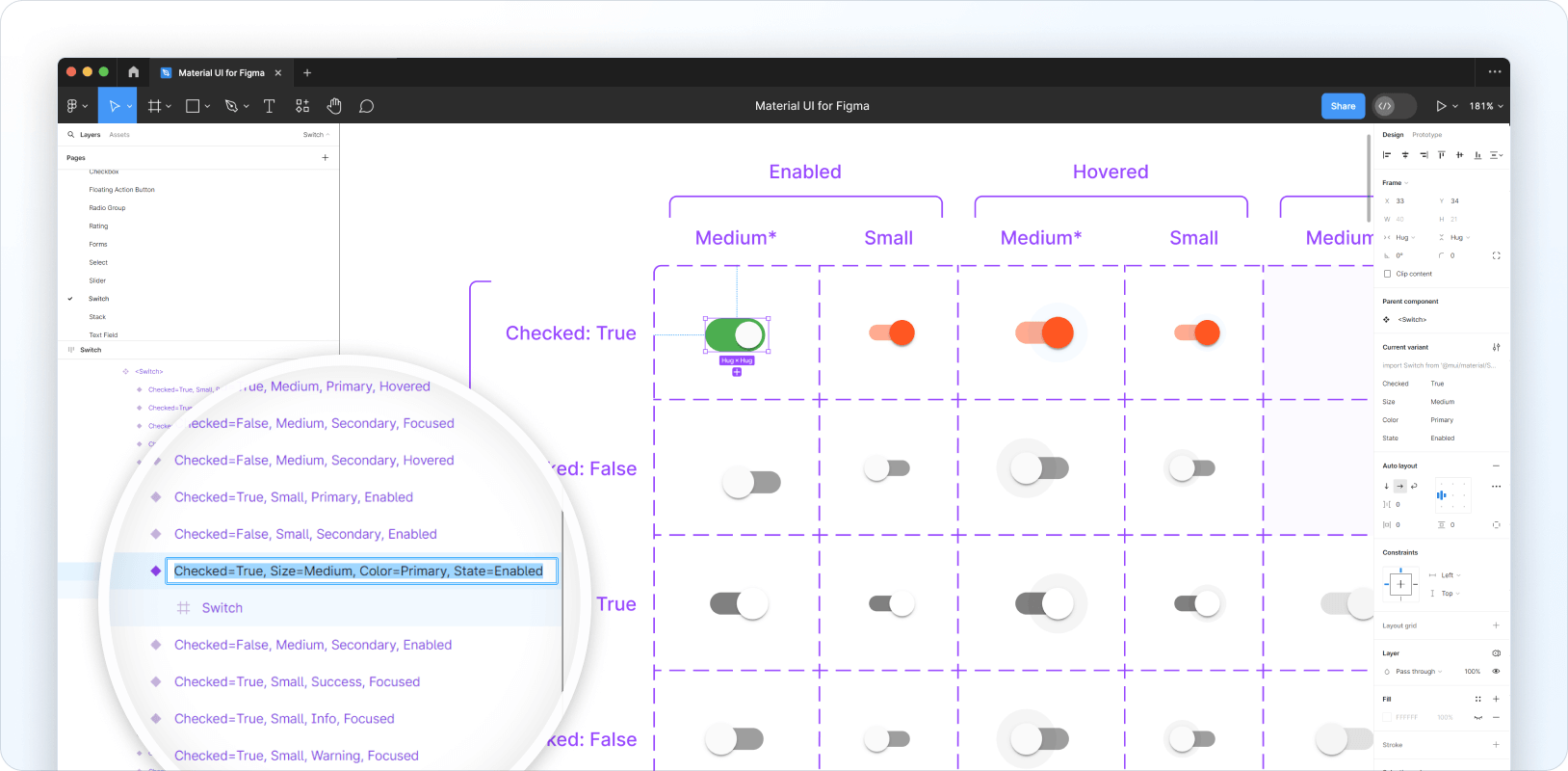
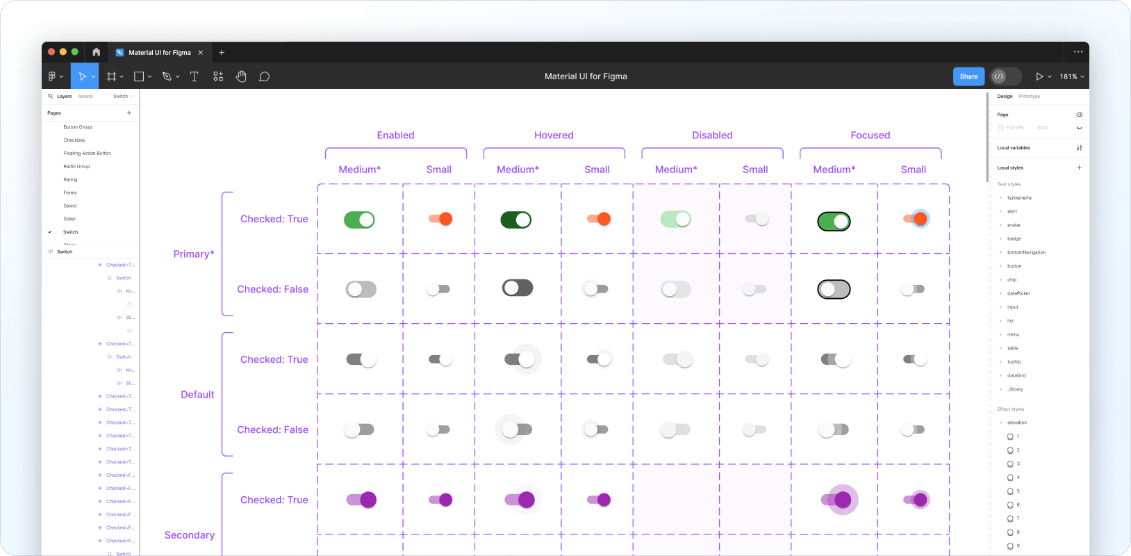
要自定义其他状态,您需要按照以下步骤将所需的设计更改应用于 Figma 中的每个变体
- 自定义单个“基础”变体——例如,处于选中状态、中等尺寸和原色的 Switch 组件。
- 克隆此变体并重命名它,以定位您想要自定义的下一个变体——例如,将
Checked=True, Size=Medium, Color=Primary, State=Enabled的克隆版本重命名为Checked=False, Size=Medium, Color=Primary, State=Enabled。 - 删除同一变体的旧版本。
- 将新版本移动到变体网格中的正确方格。
- 对变体的子图层进行必要的样式调整。
为您要自定义的每个变体重复此过程。以下是示例外观
从这里您可以运行 Sync 以生成新主题——以下是从上述示例中生成的主题
{
  components: {
    MuiSwitch: {
      styleOverrides: {
        root: {
          '&.MuiSwitch-sizeMedium:has(.MuiSwitch-colorPrimary)': {
            width: '40px',
            height: '21px',
            padding: '0',
            '& .MuiSwitch-switchBase': {
              padding: '0',
              '& .MuiSwitch-thumb': {
                width: '17px',
                height: '17px',
                background: '#FAFAFA',
              },
              '& + .MuiSwitch-track': {
                width: '38px',
                height: '21px',
                borderRadius: '100px',
                opacity: '1',
              },
            },
            '&:not(:has(.Mui-checked)):not(:has(.Mui-disabled)):not(:has(.Mui-focusVisible))': {
              '& .MuiSwitch-switchBase': {
                transform: 'translateX(3px) translateY(2px)',
                '& + .MuiSwitch-track': {
                  background: '#BDBDBD',
                },
              },
            },
            '&:not(:has(.Mui-checked)):has(.Mui-disabled):not(:has(.Mui-focusVisible))': {
              '& .MuiSwitch-switchBase': {
                transform: 'translateX(3px) translateY(2px)',
                '& + .MuiSwitch-track': {
                  background: 'rgba(229, 229, 229, 0.99)',
                },
              },
            },
            '&:not(:has(.Mui-checked)):not(:has(.Mui-disabled)):has(.Mui-focusVisible)': {
              '& .MuiSwitch-switchBase': {
                transform: 'translateX(3px) translateY(2px)',
                '& + .MuiSwitch-track': {
                  border: '1px solid #000',
                  background: '#BDBDBD',
                },
              },
            },
            '&:has(.Mui-checked):has(.Mui-disabled):not(:has(.Mui-focusVisible))': {
              '& .MuiSwitch-switchBase': {
                transform: 'translateX(19px) translateY(2px)',
                '& + .MuiSwitch-track': {
                  background: 'rgba(187, 231, 188, 0.99)',
                },
              },
            },
            '&:not(:has(.Mui-checked)):not(:has(.Mui-disabled)):not(:has(.Mui-focusVisible)):hover': {
              '& .MuiSwitch-switchBase': {
                transform: 'translateX(3px) translateY(2px)',
                '& + .MuiSwitch-track': {
                  background: '#616161',
                },
              },
            },
            '&:has(.Mui-checked):not(:has(.Mui-disabled)):not(:has(.Mui-focusVisible))': {
              '& .MuiSwitch-switchBase': {
                transform: 'translateX(19px) translateY(2px)',
                '& + .MuiSwitch-track': {
                  background: 'var(--mui-palette-success-light)',
                },
              },
            },
            '&:has(.Mui-checked):not(:has(.Mui-disabled)):not(:has(.Mui-focusVisible)):hover': {
              '& .MuiSwitch-switchBase': {
                transform: 'translateX(19px) translateY(2px)',
                '& + .MuiSwitch-track': {
                  background: 'var(--mui-palette-success-dark)',
                },
              },
            },
            '&:has(.Mui-checked):not(:has(.Mui-disabled)):has(.Mui-focusVisible)': {
              '& .MuiSwitch-switchBase': {
                transform: 'translateX(19px) translateY(2px)',
                '& + .MuiSwitch-track': {
                  border: '1px solid #000',
                  background: 'var(--mui-palette-success-light)',
                },
              },
            },
          },
        },
      },
    },
  },
}
您还可以查看 Storybook 预览来测试 Material UI 版本的组件。
使用生成的主题
以下是如何将 Sync 生成的主题添加到您的代码库的示例
import { createTheme, ThemeProvider } from '@mui/material/styles';

const theme = createTheme({
  cssVariables: true,
  shape: {
    borderRadiusRound: 999,
  },
  components: {
    MuiSwitch: {
      styleOverrides: {
        root: {
          '&.MuiSwitch-sizeMedium:has(.MuiSwitch-colorPrimary)': {
            '&:has(.Mui-checked):not(:has(.Mui-disabled)):not(:has(.Mui-focusVisible))':
              {
                width: '40px',
                height: '21px',
                padding: '0',
                '& .MuiSwitch-switchBase': {
                  transform: 'translateX(19px) translateY(2px)',
                  padding: '0',
                  '& .MuiSwitch-thumb': {
                    width: '17px',
                    height: '17px',
                    background: '#FAFAFA',
                  },
                  '& + .MuiSwitch-track': {
                    width: '38px',
                    height: '21px',
                    background: 'var(--mui-palette-success-light)',
                    borderRadius: 'var(--mui-shape-borderRadiusRound)',
                    opacity: '1',
                  },
                },
              },
          },
        },
      },
    },
  },
});

export default function MyApp(props) {
  const { Component, pageProps } = props;

  return (
    <ThemeProvider theme={theme}>
      <Component {...pageProps} />
    </ThemeProvider>
  );
}
反馈和错误报告
如果您有任何反馈,我们很乐意听取您的意见。