


世界一流的产品团队信任 MUI,为开发者和用户提供无与伦比的体验。
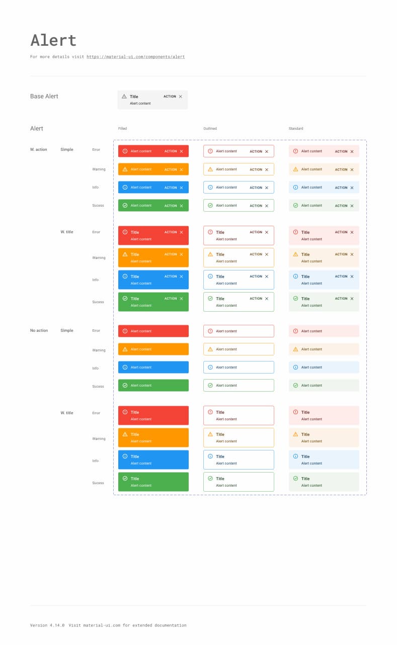
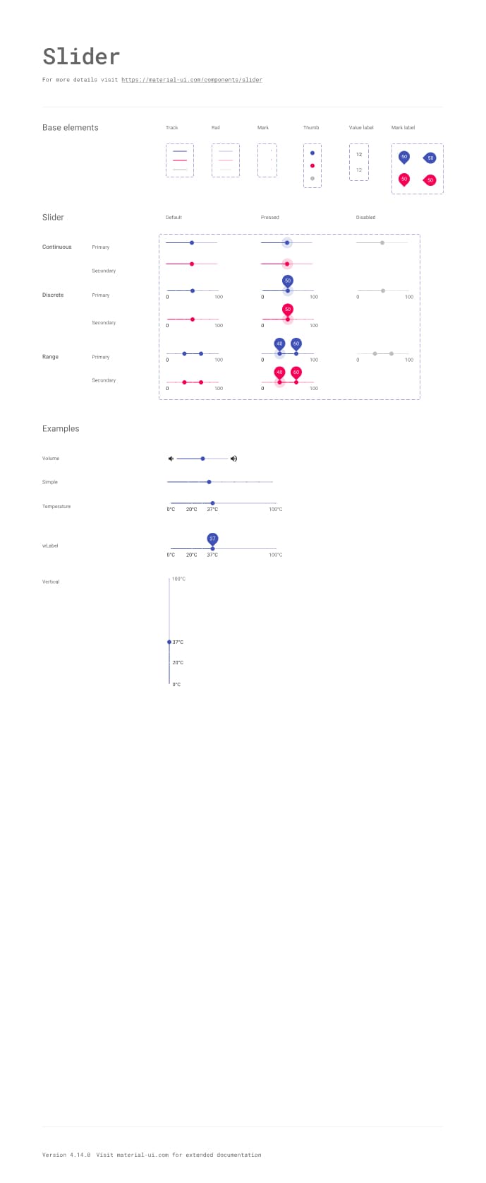
组件库
40 多个 构建模块组件
对 Material Design 的一丝不苟的实现;每个 Material UI 组件都符合形式和功能的最高标准。
<Button variant="text" startIcon={<ShoppingCartRounded />}>
  Add item
</Button>
<Button variant="contained" startIcon={<ShoppingCartRounded />}>
  Add item
</Button>
<Button variant="outlined" startIcon={<ShoppingCartRounded />}>
  Add item
</Button>
主题化
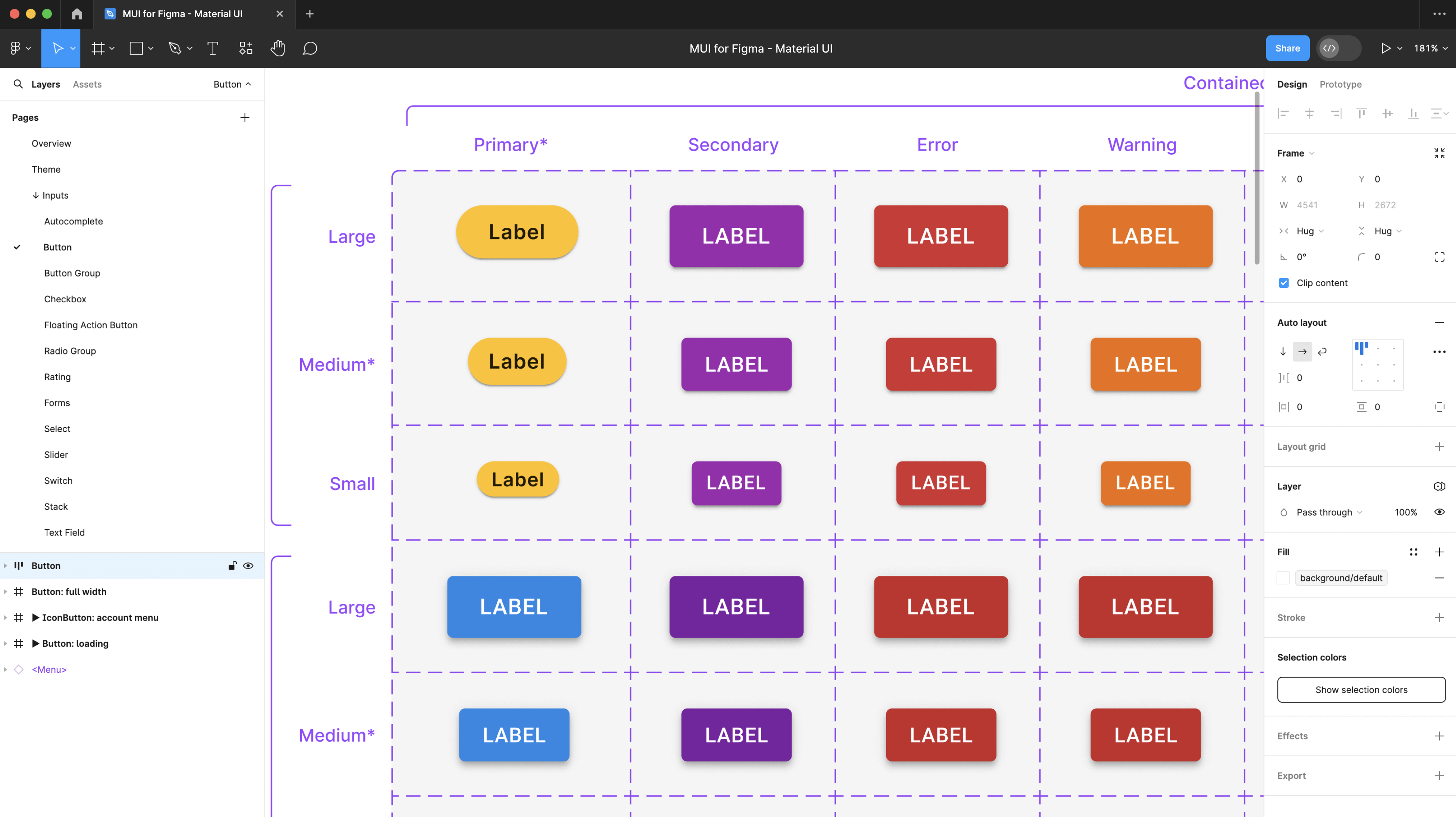
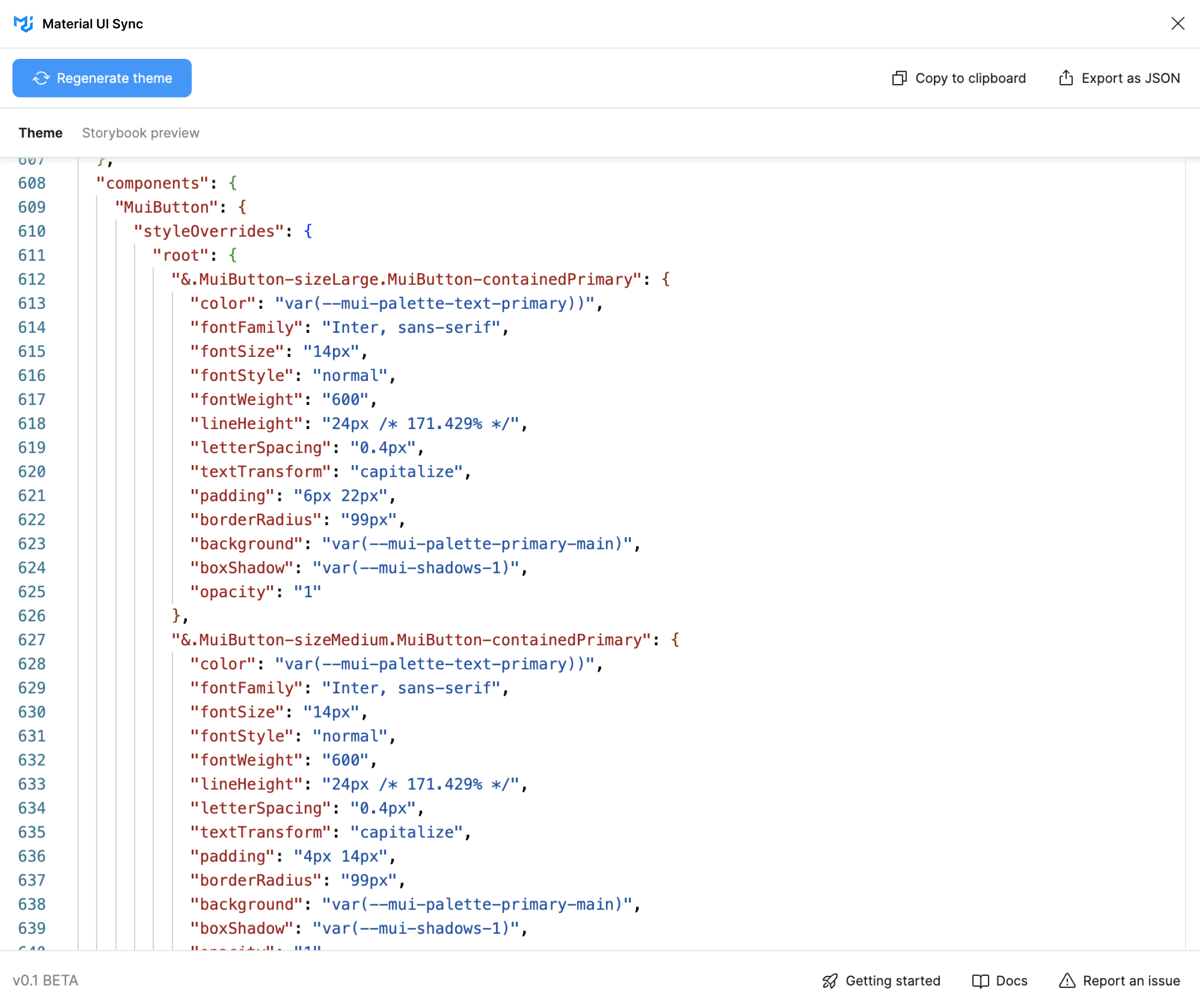
构建 您的设计系统,就像您想要的那样
从 Material Design 快速开始,或使用高级主题功能轻松定制组件以满足您的需求。
自定义主题
主题化允许您使用品牌的设计令牌,轻松使组件反映其外观和感觉。Material Design
每个组件都带有 Google 经过尝试和测试的设计系统,随时可以使用。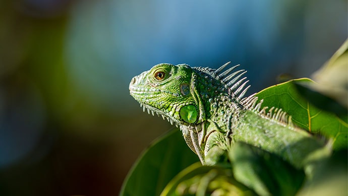
沉思的爬行动物
自然之声<Card
variant="outlined"
sx={{ p: 2,
width: { xs: '100%', sm: 'auto' },
display: 'flex',
flexDirection: { xs: 'column', sm: 'row' },
alignItems: 'center',
gap: 2,
}}
>
<CardMedia
component="img"
width="100"
height="100"
alt="Contemplative Reptile album cover"
src="/images/contemplative-reptile.jpg"
sx={{ width: { xs: '100%', sm: 100 },
}}
/>
<Stack direction="column" alignItems="center" spacing={1} useFlexGap>
<div>
<Typography color="text.primary" fontWeight="semiBold">
Contemplative Reptile
</Typography>
<Typography
variant="caption"
color="text.secondary"
fontWeight="medium"
textAlign="center"
sx={{ width: '100%' }}
>
Sounds of Nature
</Typography>
</div>
<Stack direction="row" alignItems="center" spacing={1} useFlexGap>
<IconButton aria-label="Shuffle" disabled size="small">
<ShuffleRoundedIcon fontSize="small" />
</IconButton>
<IconButton aria-label="Fast rewind" disabled size="small">
<FastRewindRounded fontSize="small" />
</IconButton>
<IconButton
aria-label={paused ? 'Play music' : 'Pause music'}
onClick={() => setPaused((val) => !val)}
sx={{ mx: 1 }}
>
{paused ? <PlayArrowRounded /> : <PauseRounded />}
</IconButton>
<IconButton aria-label="Fast forward" disabled size="small">
<FastForwardRounded fontSize="small" />
</IconButton>
<IconButton aria-label="Loop music" disabled size="small">
<LoopRoundedIcon fontSize="small" />
</IconButton>
</Stack>
</Stack>
</Card>样式
使用 CSS 实用程序 快速添加和调整任何样式
CSS 实用程序使您可以更快地移动,并在样式化任何组件时获得流畅的开发者体验。
利用主题中的令牌
轻松使用主题中定义的任何 CSS 属性的设计令牌。无需上下文切换
样式和组件用法都在同一个地方,就在您需要它们的地方。系统属性内联响应式样式
用于编写与主题断点匹配的 CSS 媒体查询的优雅 API。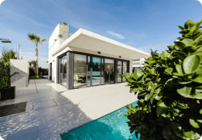
美国亚利桑那州凤凰城主街 123 号
28 万美元 - 31 万美元
评分:85%
<Card
  variant="outlined"
  sx={{ p: 2, display: 'flex', flexWrap: 'wrap', zIndex: 1 }}
>
  <CardMedia
    component="img"
    width="100"
    height="100"
    alt="123 Main St, Phoenix, AZ cover"
    src="/images/real-estate.png"
    sx={{
      borderRadius: '6px',
      width: { xs: '100%', sm: 100 },
    }}
  />
  <Box sx={{ alignSelf: 'center', ml: 2 }}>
    <Typography variant="body2" color="text.secondary" fontWeight="regular">
      123 Main St, Phoenix, AZ, USA
    </Typography>
    <Typography fontWeight="bold" noWrap gutterBottom>
      $280k - $310k
    </Typography>
    <Chip
      size="small"
      variant="outlined"
      icon={<InfoRounded />}
      label="Confidence score: 85%"
      sx={(theme) => ({
        '.MuiChip-icon': { fontSize: 16, ml: '4px', color: 'success.500' },
        bgcolor: 'success.50',
        borderColor: 'success.100',
        color: 'success.900',
        ...theme.applyDarkStyles({
          bgcolor: 'primaryDark.700',
          color: 'success.200',
          borderColor: 'success.900',
        }),
      })}
    />
  </Box>
</Card>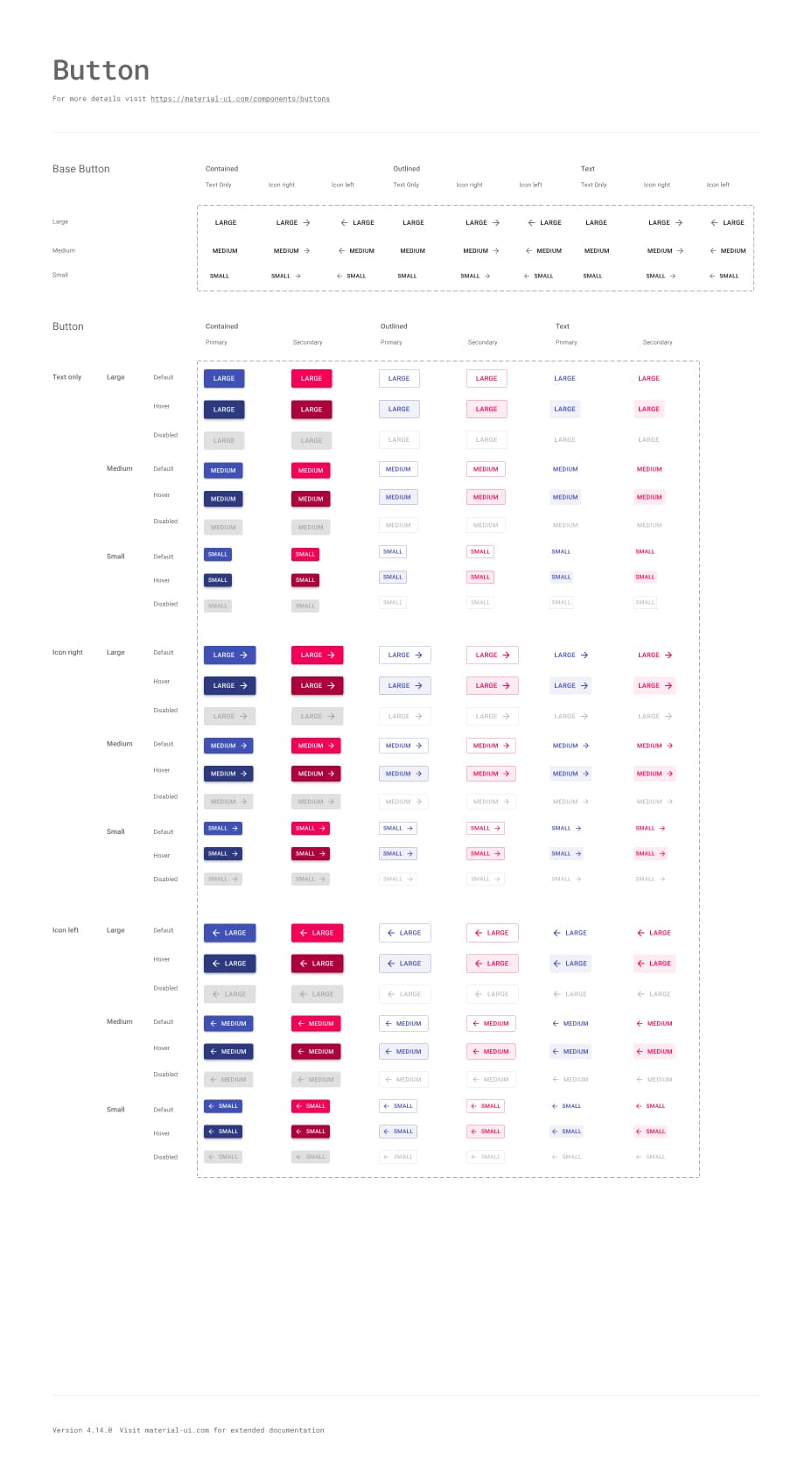
Material UI 与 MUI Base
Material UI 实现了 Google 的 Material Design,而 MUI Base 具有许多相同的组件,但没有 Material Design 实现。
它是否支持 Material Design 3?
Material UI 目前采用 Material Design 2。您可以关注 这个 GitHub issue 以获取未来设计相关的更新。