使用 Tailwind CSS
了解如何使用 Tailwind CSS 样式化 MUI Base 组件。
开始使用
本指南的目标是教您如何在构建交互式且可访问的应用程序的同时,使用 Tailwind CSS 样式化 MUI Base 组件。
先决条件
本指南假设您具备以下方面的基本工作知识
- Tailwind CSS
- React 中的 TypeScript
- 构建 React UI 组件
我们不会在此处详细介绍这些主题。
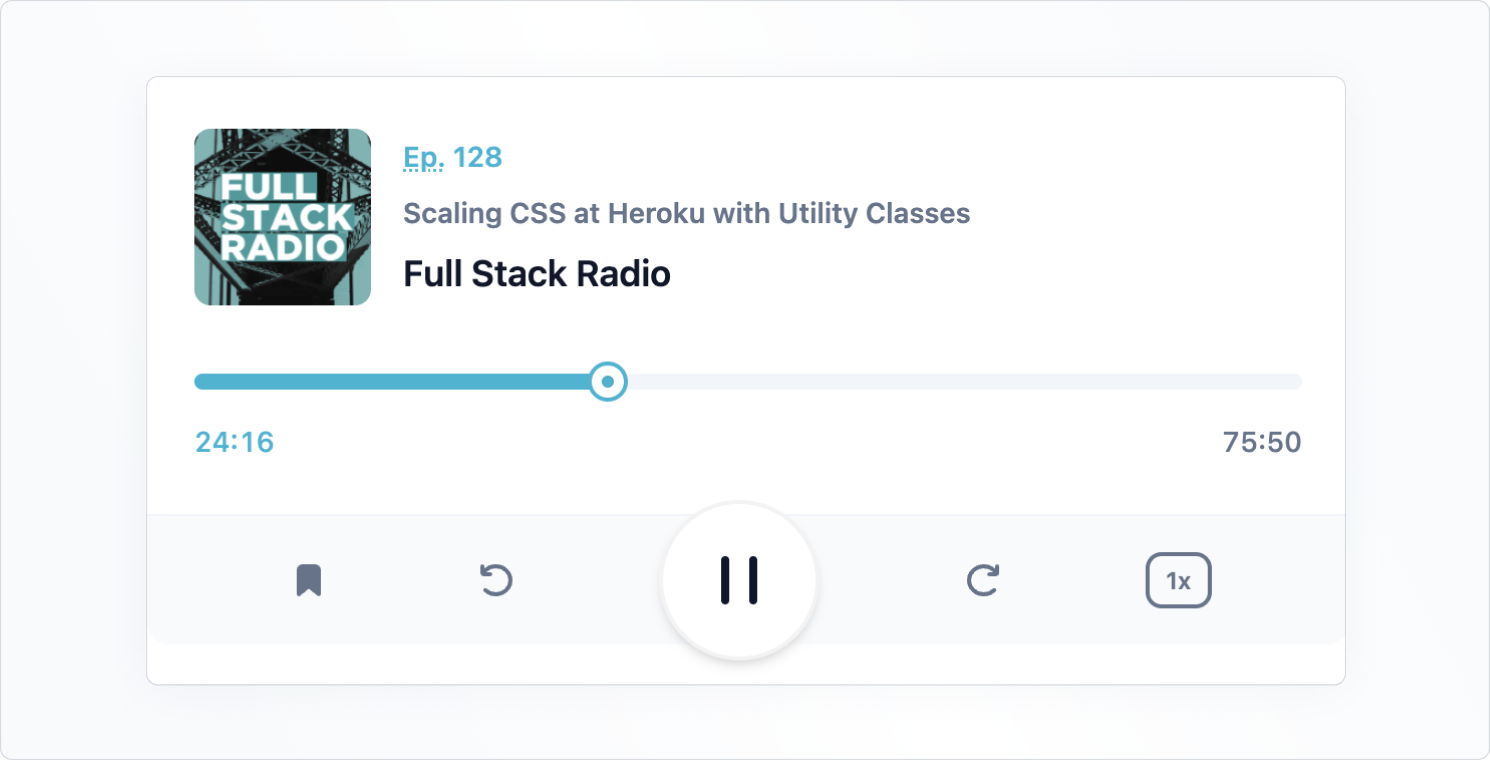
本指南的最终结果是一个交互式媒体播放器界面。以下是它最终的样子
设置项目
在本指南中,我们将使用 带有 TypeScript 的 create-react-app。创建项目后,请按照 Tailwind CSS 安装页面上给出的说明配置 tailwind。接下来,在项目中安装 @mui/base
npm install @mui/base
添加播放器标记
现在,创建一个名为 Player.tsx 的文件,并添加以下标记,其中包括 Tailwind CSS 类
Player.tsx
import * as React from 'react';

const Player = React.forwardRef(function Player(
  props: { className?: string },
  ref: React.ForwardedRef<HTMLDivElement>,
) {
  const { className = '', ...other } = props;
  return (
    <div
      className={`max-w-[600px] max-h-[240px] m-auto ${className}`}
      {...other}
      ref={ref}
    >
      <div className="bg-white border-slate-100 dark:bg-slate-800 dark:border-slate-500 border-b rounded-t-xl p-4 pb-6 sm:p-10 sm:pb-8 lg:p-6 xl:p-10 xl:pb-8 space-y-6 sm:space-y-8 lg:space-y-6 xl:space-y-8">
        <div className="flex items-center space-x-4">
          <img
            src="https://mui.org.cn/static/base-ui/with-tailwind-css/full-stack-radio.png"
            alt=""
            width="88"
            height="88"
            className="flex-none rounded-lg bg-slate-100"
            loading="lazy"
          />
          <div className="min-w-0 flex-auto space-y-1 font-semibold">
            <p className="text-cyan-500 dark:text-cyan-400 text-sm leading-6">
              <abbr title="Episode">Ep.</abbr> 128
            </p>
            <h2 className="text-slate-500 dark:text-slate-400 text-sm leading-6 truncate">
              Scaling CSS at Heroku with Utility Classes
            </h2>
            <p className="text-slate-900 dark:text-slate-50 text-lg">
              Full Stack Radio
            </p>
          </div>
        </div>
        <div className="space-y-2">
          <div className="relative">
            <div className="bg-slate-100 dark:bg-slate-700 rounded-full overflow-hidden">
              <div
                className="bg-cyan-500 dark:bg-cyan-400 w-1/2 h-2"
                role="progressbar"
                aria-label="music progress"
                aria-valuenow={1456}
                aria-valuemin={0}
                aria-valuemax={4550}
              ></div>
            </div>
            <div className="ring-cyan-500 dark:ring-cyan-400 ring-2 absolute left-1/2 top-1/2 w-4 h-4 -mt-2 -ml-2 flex items-center justify-center bg-white rounded-full shadow">
              <div className="w-1.5 h-1.5 bg-cyan-500 dark:bg-cyan-400 rounded-full ring-1 ring-inset ring-slate-900/5"></div>
            </div>
          </div>
          <div className="flex justify-between text-sm leading-6 font-medium tabular-nums">
            <div className="text-cyan-500 dark:text-slate-100">24:16</div>
            <div className="text-slate-500 dark:text-slate-400">75:50</div>
          </div>
        </div>
      </div>
      <div className="bg-slate-50 text-slate-500 dark:bg-slate-600 dark:text-slate-200 rounded-b-xl flex items-center">
        <div className="flex-auto flex items-center justify-evenly">
          <button type="button" aria-label="Add to favorites">
            <svg width="24" height="24">
              <path
                d="M7 6.931C7 5.865 7.853 5 8.905 5h6.19C16.147 5 17 5.865 17 6.931V19l-5-4-5 4V6.931Z"
                fill="currentColor"
                stroke="currentColor"
                strokeWidth="2"
                strokeLinecap="round"
                strokeLinejoin="round"
              />
            </svg>
          </button>
          <button
            type="button"
            className="hidden sm:block lg:hidden xl:block"
            aria-label="Previous"
          >
            <svg width="24" height="24" fill="none">
              <path
                d="m10 12 8-6v12l-8-6Z"
                fill="currentColor"
                stroke="currentColor"
                strokeWidth="2"
                strokeLinecap="round"
                strokeLinejoin="round"
              />
              <path
                d="M6 6v12"
                stroke="currentColor"
                strokeWidth="2"
                strokeLinecap="round"
                strokeLinejoin="round"
              />
            </svg>
          </button>
          <button type="button" aria-label="Rewind 10 seconds">
            <svg width="24" height="24" fill="none">
              <path
                d="M6.492 16.95c2.861 2.733 7.5 2.733 10.362 0 2.861-2.734 2.861-7.166 0-9.9-2.862-2.733-7.501-2.733-10.362 0A7.096 7.096 0 0 0 5.5 8.226"
                stroke="currentColor"
                strokeWidth="2"
                strokeLinecap="round"
                strokeLinejoin="round"
              />
              <path
                d="M5 5v3.111c0 .491.398.889.889.889H9"
                stroke="currentColor"
                strokeWidth="2"
                strokeLinecap="round"
                strokeLinejoin="round"
              />
            </svg>
          </button>
        </div>
        <button
          type="button"
          className="bg-white text-slate-900 dark:bg-slate-100 dark:text-slate-700 flex-none -my-2 mx-auto w-20 h-20 rounded-full ring-1 ring-slate-900/5 shadow-md flex items-center justify-center"
          aria-label="Pause"
        >
          <svg width="30" height="32" fill="currentColor">
            <rect x="6" y="4" width="4" height="24" rx="2" />
            <rect x="20" y="4" width="4" height="24" rx="2" />
          </svg>
        </button>
        <div className="flex-auto flex items-center justify-evenly">
          <button type="button" aria-label="Skip 10 seconds">
            <svg width="24" height="24" fill="none">
              <path
                d="M17.509 16.95c-2.862 2.733-7.501 2.733-10.363 0-2.861-2.734-2.861-7.166 0-9.9 2.862-2.733 7.501-2.733 10.363 0 .38.365.711.759.991 1.176"
                stroke="currentColor"
                strokeWidth="2"
                strokeLinecap="round"
                strokeLinejoin="round"
              />
              <path
                d="M19 5v3.111c0 .491-.398.889-.889.889H15"
                stroke="currentColor"
                strokeWidth="2"
                strokeLinecap="round"
                strokeLinejoin="round"
              />
            </svg>
          </button>
          <button
            type="button"
            className="hidden sm:block lg:hidden xl:block"
            aria-label="Next"
          >
            <svg width="24" height="24" fill="none">
              <path
                d="M14 12 6 6v12l8-6Z"
                fill="currentColor"
                stroke="currentColor"
                strokeWidth="2"
                strokeLinecap="round"
                strokeLinejoin="round"
              />
              <path
                d="M18 6v12"
                stroke="currentColor"
                strokeWidth="2"
                strokeLinecap="round"
                strokeLinejoin="round"
              />
            </svg>
          </button>
          <button
            type="button"
            className="rounded-lg text-xs leading-6 font-semibold px-2 ring-2 ring-inset ring-slate-500 text-slate-500 dark:text-slate-100 dark:ring-0 dark:bg-slate-500"
          >
            1x
          </button>
        </div>
      </div>
    </div>
  );
});

export default Player;
接下来,将 Player 组件添加到 App.tsx 文件。
App.tsx
import * as React from 'react';
import Player from './Player';

function App() {
  return <Player />;
}

export default App;
您现在应该在页面上看到渲染的播放器,但该组件尚不具备交互性——这将在下一步中介绍。
添加交互式滑块组件
创建滑块组件
让我们首先使用 MUI Base 的 Slider 组件为滑块赋予生命。首先,创建一个名为 Slider.tsx 的新文件。将以下代码复制并粘贴到文件中
Slider.tsx
import * as React from 'react';
import {
  Slider as BaseSlider,
  SliderThumbSlotProps,
  SliderProps,
} from '@mui/base/Slider';

const Slider = React.forwardRef(function Slider(
  props: SliderProps,
  ref: React.ForwardedRef<HTMLSpanElement>,
) {
  return (
    <BaseSlider
      {...props}
      ref={ref}
      slotProps={{
        thumb: {
          className:
            'ring-cyan-500 dark:ring-cyan-400 ring-2 w-4 h-4 -mt-1 -ml-2 flex items-center justify-center bg-white rounded-full shadow absolute',
        },
        root: { className: 'w-full relative inline-block h-2 cursor-pointer' },
        rail: {
          className:
            'bg-slate-100 dark:bg-slate-700 h-2 w-full rounded-full block absolute',
        },
        track: {
          className: 'bg-cyan-500 dark:bg-cyan-400 h-2 absolute rounded-full',
        },
      }}
    />
  );
});

export default Slider;
为了为组件的每个部分分配特定的 Tailwind CSS 实用程序类,我们使用了 slotProps。其中大多数是从原始标记中复制过来的,现在它是交互式的,因此进行了一些小的调整。
将滑块添加到播放器
现在让我们将 Slider 添加到 Player 组件中
Player.tsx
--- a/src/Player.tsx
+++ b/src/Player.tsx
@@ -1,4 +1,5 @@
 import * as React from 'react';
+import Slider from './Slider';

 const Player = React.forwardRef(function Player(props: { className?: string }, ref: React.ForwardedRef<HTMLDivElement>) {
   const { className = '', ...other } = props;
@@ -21,12 +22,7 @@ const Player = React.forwardRef(function Player(props: { className?: string }, r
         </div>
         <div className="space-y-2">
           <div className="relative">
-            <div className="bg-slate-100 dark:bg-slate-700 rounded-full overflow-hidden">
-              <div className="bg-cyan-500 dark:bg-cyan-400 w-1/2 h-2" role="progressbar" aria-label="music progress" aria-valuenow={1456} aria-valuemin={0} aria-valuemax={4550}></div>
-            </div>
-            <div className="ring-cyan-500 dark:ring-cyan-400 ring-2 absolute left-1/2 top-1/2 w-4 h-4 -mt-2 -ml-2 flex items-center justify-center bg-white rounded-full shadow">
-              <div className="w-1.5 h-1.5 bg-cyan-500 dark:bg-cyan-400 rounded-full ring-1 ring-inset ring-slate-900/5"></div>
-            </div>
+            <Slider step={50} defaultValue={1456} max={4550} min={0} />
           </div>
           <div className="flex justify-between text-sm leading-6 font-medium tabular-nums">
             <div className="text-cyan-500 dark:text-slate-100">24:16</div>
您应该看到这个
自定义滑块拇指
即使滑块现在是交互式的,但它看起来仍然与原始设计不完全相同。这是因为我们尚未定义表示拇指内部点的元素。
为此,仅仅为拇指使用类是不够的——我们还需要渲染一个自定义组件,该组件在 Slider 的 slots 属性中传递。
Slider.tsx
--- a/src/Slider.tsx
+++ b/src/Slider.tsx
@@ -1,6 +1,17 @@
 import * as React from 'react';
 import { Slider as BaseSlider, SliderThumbSlotProps, SliderProps } from '@mui/base/Slider';

+const Thumb = React.forwardRef(function Thumb(
+  props: SliderThumbSlotProps,
+  ref: React.ForwardedRef<HTMLSpanElement>,
+) {
+  const { ownerState, className = '', children, ...other } = props;
+  return (<span className={`${className} ring-cyan-500 dark:ring-cyan-400 ring-2 w-4 h-4 -mt-1 -ml-2 flex items-center justify-center bg-white rounded-full shadow absolute`} {...other} ref={ref}>
+    <span className="w-1.5 h-1.5 bg-cyan-500 dark:bg-cyan-400 rounded-full ring-1 ring-inset ring-slate-900/5"></span>
+    {children}
+  </span>);
+});
+
 const Slider = React.forwardRef(function Slider(
   props: SliderProps,
   ref: React.ForwardedRef<HTMLSpanElement>,
@@ -8,9 +19,11 @@ const Slider = React.forwardRef(function Slider(
   return (<BaseSlider
     {...props}
     ref={ref}
+    slots={{
+      thumb: Thumb,
+    }}
     slotProps={{
       root: { className: 'w-full relative inline-block h-2 cursor-pointer' },
-      thumb: { className: 'ring-cyan-500 dark:ring-cyan-400 ring-2 w-4 h-4 -mt-1 -ml-2 flex items-center justify-center bg-white rounded-full shadow absolute' },
       rail: { className: 'bg-slate-100 dark:bg-slate-700 h-2 w-full rounded-full block absolute' },
       track: { className: 'bg-cyan-500 dark:bg-cyan-400 h-2 absolute rounded-full' }
     }}
刷新页面后,您应该看到拇指现在看起来与设计完全相同。
上面的代码创建了一个自定义组件,其中包含所有必要的类和属性,可以作为拇指。由于我们希望在拇指内部添加一个额外的点,因此我们需要在拇指的标记中添加新元素:一个 <span>。请注意,在拇指之后,我们仍在渲染通过 props 传递的 children。这很重要,因为在这种情况下,children 包含一个隐藏的 <input> 元素,该元素使拇指可访问。
这只是一个示例,但是对于所有 MUI Base 组件,都可以使用这种为每个插槽构建自定义组件的模式。
此外,每个插槽都会收到一个 ownerState 对象,其中包含所有者组件的 props 和状态。如果您想根据某些内部状态设置组件样式,这将非常有用。
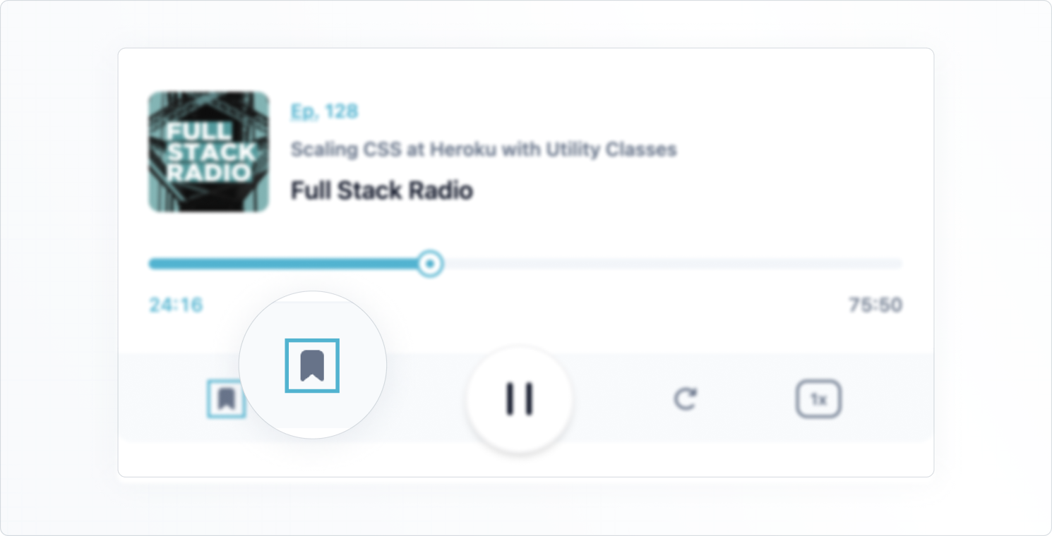
为按钮添加自定义焦点选择器
为了完成本指南,让我们看看如何根据组件的内部状态添加自定义样式。我们将创建一个自定义 Button 组件,该组件使用来自 MUI Base Button 的 focusVisible 状态在其周围应用青色环。
这就是它的样子
创建一个 Button.tsx 文件并复制以下代码
Button.tsx
import * as React from 'react';
import {
  Button as BaseButton,
  ButtonOwnerState,
  ButtonProps,
} from '@mui/base/Button';

const Button = React.forwardRef(function Button(
  props: ButtonProps,
  ref: React.ForwardedRef<HTMLButtonElement>,
) {
  return (
    <BaseButton
      {...props}
      slotProps={{
        root: (state: ButtonOwnerState) => ({
          className: `hover:text-cyan-500 transition-colors ${
            state.focusVisible ? 'outline-0 ring-2 ring-cyan-500' : ''
          }`,
        }),
      }}
      ref={ref}
    />
  );
});

export default Button;
请注意,我们在 slotProps 内的 root 元素上使用了回调。如果 focusVisible 为 true,这允许我们有条件地应用实用程序类。
现在,让我们用新的自定义 Button 组件替换初始标记中的所有按钮。
Player.tsx
--- a/src/Player.tsx
+++ b/src/Player.tsx
@@ -1,4 +1,5 @@
 import * as React from 'react';
+import Button from './Button';
 import Slider from './Slider';

 const Player = React.forwardRef(function Player(props: { className?: string }, ref: React.ForwardedRef<HTMLDivElement>) {
@@ -32,46 +33,46 @@ const Player = React.forwardRef(function Player(props: { className?: string }, r
       </div>
       <div className="bg-slate-50 text-slate-500 dark:bg-slate-600 dark:text-slate-200 rounded-b-xl flex items-center">         <div className="flex-auto flex items-center justify-evenly">
-          <button type="button" aria-label="Add to favorites">
+          <Button aria-label="Add to favorites">
             <svg width="24" height="24">
               <path d="M7 6.931C7 5.865 7.853 5 8.905 5h6.19C16.147 5 17 5.865 17 6.931V19l-5-4-5 4V6.931Z" fill="currentColor" stroke="currentColor" strokeWidth="2" strokeLinecap="round" strokeLinejoin="round" />
             </svg>
-          </button>
-          <button type="button" className="hidden sm:block lg:hidden xl:block" aria-label="Previous">
+          </Button>
+          <Button className="hidden sm:block lg:hidden xl:block" aria-label="Previous">
             <svg width="24" height="24" fill="none">
               <path d="m10 12 8-6v12l-8-6Z" fill="currentColor" stroke="currentColor" strokeWidth="2" strokeLinecap="round" strokeLinejoin="round" />
               <path d="M6 6v12" stroke="currentColor" strokeWidth="2" strokeLinecap="round" strokeLinejoin="round" />
             </svg>
-          </button>
-          <button type="button" aria-label="Rewind 10 seconds">
+          </Button>
+          <Button aria-label="Rewind 10 seconds">
             <svg width="24" height="24" fill="none">
               <path d="M6.492 16.95c2.861 2.733 7.5 2.733 10.362 0 2.861-2.734 2.861-7.166 0-9.9-2.862-2.733-7.501-2.733-10.362 0A7.096 7.096 0 0 0 5.5 8.226" stroke="currentColor" strokeWidth="2" strokeLinecap="round" strokeLinejoin="round" />
               <path d="M5 5v3.111c0 .491.398.889.889.889H9" stroke="currentColor" strokeWidth="2" strokeLinecap="round" strokeLinejoin="round" />
             </svg>
-          </button>
+          </Button>
         </div>
-        <button type="button" className="bg-white text-slate-900 dark:bg-slate-100 dark:text-slate-700 flex-none -my-2 mx-auto w-20 h-20 rounded-full ring-1 ring-slate-900/5 shadow-md flex items-center justify-center" aria-label="Pause">
+        <Button className="bg-white text-slate-900 dark:bg-slate-100 dark:text-slate-700 flex-none -my-2 mx-auto w-20 h-20 rounded-full border-2 border-slate-900/5 shadow-md flex items-center justify-center" aria-label="Pause">
           <svg width="30" height="32" fill="currentColor">
             <rect x="6" y="4" width="4" height="24" rx="2" />
             <rect x="20" y="4" width="4" height="24" rx="2" />
           </svg>
-        </button>
+        </Button>
         <div className="flex-auto flex items-center justify-evenly">
-          <button type="button" aria-label="Skip 10 seconds">
+          <Button aria-label="Skip 10 seconds">
             <svg width="24" height="24" fill="none">
               <path d="M17.509 16.95c-2.862 2.733-7.501 2.733-10.363 0-2.861-2.734-2.861-7.166 0-9.9 2.862-2.733 7.501-2.733 10.363 0 .38.365.711.759.991 1.176" stroke="currentColor" strokeWidth="2" strokeLinecap="round" strokeLinejoin="round" />
               <path d="M19 5v3.111c0 .491-.398.889-.889.889H15" stroke="currentColor" strokeWidth="2" strokeLinecap="round" strokeLinejoin="round" />
             </svg>
-          </button>
-          <button type="button" className="hidden sm:block lg:hidden xl:block" aria-label="Next">
+          </Button>
+          <Button className="hidden sm:block lg:hidden xl:block" aria-label="Next">
             <svg width="24" height="24" fill="none">
               <path d="M14 12 6 6v12l8-6Z" fill="currentColor" stroke="currentColor" strokeWidth="2" strokeLinecap="round" strokeLinejoin="round" />
               <path d="M18 6v12" stroke="currentColor" strokeWidth="2" strokeLinecap="round" strokeLinejoin="round" />
             </svg>
-          </button>
-          <button type="button" className="rounded-lg text-xs leading-6 font-semibold px-2 ring-2 ring-inset ring-slate-500 text-slate-500 dark:text-slate-100 dark:ring-0 dark:bg-slate-500">
+          </Button>
+          <Button className="rounded-lg text-xs leading-6 font-semibold px-2 border-2 border-slate-500 text-slate-500 dark:text-slate-100 dark:ring-0 dark:bg-slate-500 hover:ring-cyan-500">
             1x
-          </button>
+          </Button>
         </div>
       </div>
     </div>
某些按钮上的一些类略有更改,因此我们有一个一致的焦点指示器。
我们学到了什么
这些是我们在本指南中涵盖的内容
✅ 如何使用 Tailwind CSS 实用程序类来样式化 MUI Base 组件,使用 slotProps 属性来定位组件内的特定插槽。
✅ 如何在更复杂的自定义场景中为特定插槽创建自定义组件。我们使用 component 属性将它们传递到父组件中。
✅ 如何使用回调作为 slotProps 属性的值,根据所有者组件的状态应用条件样式。
在 MUI Base with Tailwind CSS 示例项目中获取本指南中使用的所有代码。