为什么选择 Base UI
基本构建块
用于简洁且易于访问的 UI
Base UI 抽象化了 UI 开发中更令人沮丧的方面(如可访问性、跨浏览器兼容性和事件处理),因此您可以跳过这些,直接进入设计实现。
替代库,例如
无样式组件
选择你自己的
CSS 冒险
Base UI 的骨架组件为您提供了一个坚实的基础,可以轻松应用自定义样式。无需覆盖任何默认值,您可以自由地从头开始,使用原生 CSS、Tailwind CSS、MUI System 或您喜欢的任何其他框架。
第一页
import { Tabs } from '@mui/base/Tabs';
import { TabsList } from '@mui/base/TabsList';
import { TabPanel } from '@mui/base/TabPanel';
import { Tab } from '@mui/base/Tab';
import { styled } from '@mui/system';

const StyledTabsList = styled('div')`
  min-width: 300px;
  background-color: var(--primary);
  border-radius: 12px;
  margin-bottom: 16px;
  display: flex;
  align-items: center;
  justify-content: center;
  align-content: space-between;
  box-shadow: var(--shadow);
`;

const StyledTabPanel = styled('div')`
  width: 100%;
  font-family: 'IBM Plex Sans', sans-serif;
  font-size: 0.875rem;
`;

const StyledTab = styled('button')`
  font-family: 'IBM Plex Sans', sans-serif;
  color: white;
  cursor: pointer;
  font-size: 0.875rem;
  font-weight: bold;
  background-color: transparent;
  width: 100%;
  padding: 12px;
  margin: 6px 6px;
  border: none;
  border-radius: 7px;
  display: flex;
  justify-content: center;
  transition: all 120ms ease;
  user-select: none;

  &:hover {
    background-color: var(--primary-hover);
  }

  &:focus-visible {
    color: #FFF;
    outline: 2px solid rgba(255,255,255,0.8);
    outline-offset: 2px;
  }

  &.base--selected {
    background-color: #FFF;
    color: var(--primary);
  }
`;

<Tabs selectionFollowsFocus defaultValue={0}>
  <TabsList slots={{ root: StyledTabsList }}>
    <Tab slots={{ root: StyledTab }}>One</Tab>
    <Tab slots={{ root: StyledTab }}>Two</Tab>
    <Tab slots={{ root: StyledTab }}>Three</Tab>
  </TabsList>
  <TabPanel slots={{ root: StyledTabPanel }} value={0}>
    First page
  </TabPanel>
  <TabPanel slots={{ root: StyledTabPanel }} value={1}>
    Second page
  </TabPanel>
  <TabPanel slots={{ root: StyledTabPanel }} value={2}>
    Third page
  </TabPanel>
</Tabs>自定义
无限可能
使用轻量级 API
使用 Base UI,您可以自由决定要自定义组件结构和样式的程度。
应用自定义 CSS 规则
您的 CSS,您的规则。使用 Base UI,没有样式需要覆盖,因此您可以从头开始。覆盖子组件插槽
默认 DOM 结构不适合您的需求?使用 `slots` 属性将任何节点替换为您喜欢的元素。使用 Hook 创建自定义组件
Base UI 包含底层 Hook,用于为您的完全自定义构建的组件添加功能。import clsx from 'clsx';
import { styled } from '@mui/system';
import { SwitchUnstyled } from '@mui/base/Switch';
import { useSwitch } from '@mui/base/useSwitch';
const StyledSwitchRoot = styled('span')(`
font-size: 0;
position: relative;
display: inline-block;
width: 40px;
height: 24px;
margin: 10px;
cursor: pointer;
border-radius: 16px;
background: #A0AAB4;
&.Mui-disabled {
opacity: 0.4;
cursor: not-allowed;
}
&.Mui-checked {
background: #007FFF;
& .MuiSwitch-thumb {
left: 20px;
}
}
&.Mui-focusVisible {
outline: 2px solid #007FFF;
outline-offset: 2px;
}
`);
const StyledSwitchInput = styled('input')`
cursor: inherit;
position: absolute;
width: 100%;
height: 100%;
top: 0;
left: 0;
opacity: 0;
z-index: 1;
margin: 0;
`;
const StyledSwitchThumb = styled('span')`
display: block;
width: 16px;
height: 16px;
top: 4px;
left: 4px;
border-radius: 16px;
background-color: #FFF;
position: relative;
transition-property: all;
transition-timing-function: cubic-bezier(0.4, 0, 0.2, 1);
transition-duration: 120ms;
&.Mui-checked {
left: 20px;
}
`;
function SwitchFromHook(props) {
const {
getInputProps,
checked,
disabled,
focusVisible,
} = useSwitch(props);
const stateClasses = {
'Mui-checked': checked,
'Mui-disabled': disabled,
'Mui-focusVisible': focusVisible,
};
return (
<StyledSwitchRoot className={clsx(stateClasses)}>
<StyledSwitchThumb className={clsx(stateClasses)} />
<StyledSwitchInput {...getInputProps()} aria-label="Demo switch" />
</StyledSwitchRoot>
);
}
function App() {
return (
<SwitchUnstyled
slots={{
root: StyledSwitchRoot,
input: StyledSwitchInput,
thumb: StyledSwitchThumb,
}}
slotProps={{
input: { 'aria-label': 'Demo switch' },
}}
/>
<SwitchFromHook />
)
}Nhost 的仪表板
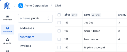
Nhost 的新仪表板,由 Base UI 提供支持 / 查看博客文章
“在考虑了各种选项之后,我们决定将我们的自定义组件迁移到 Material UI,那时我们发现了 Base UI。作为一组无头组件,它提供了我们实现设计系统同时保持完全自定义性所需的全部功能。对可访问性的关注也是一个很大的优势,因为它确保了我们的仪表板可供所有人使用。低级组件钩子只是锦上添花。”
Szilárd Dóró
高级软件工程师

社区
加入我们的全球社区
没有我们全球的贡献者社区,Base UI 就无法实现。今天就加入我们,在您需要时获得帮助,并在您力所能及的时候伸出援手。
Base UI 与 Material UI
Base UI 拥有许多与 Material UI 相同的组件,但没有 Material Design 的实现。
它是否自带样式?
Base UI *不* 包含任何默认主题或内置样式引擎。如果您需要完全控制应用程序的 CSS 实现方式,那么这是一个很好的选择。